Time: 2024-09-19 Thursday 12:49:01
Author: Jackasher
Float横向布局
试着利用float完成页面的布局,这样就可以开始完成基本的页面了
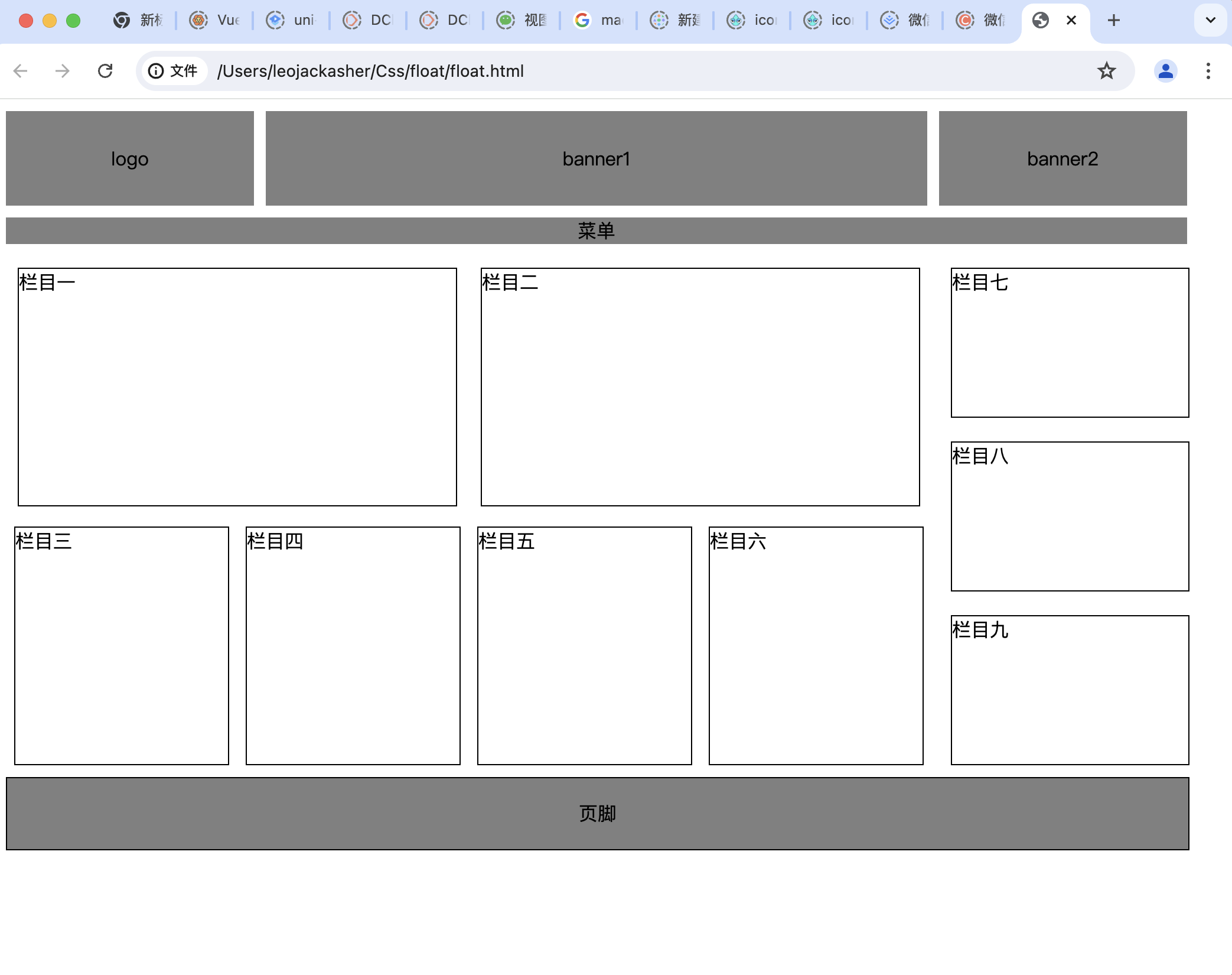
浮动的解决基本就是clear,然后垂直居中显示可以用line-height
1
2
3
4
5
6
7
8
9
10
11
12
13
14
15
16
17
18
19
20
21
22
23
24
25
26
27
28
29
30
31
32
33
34
35
36
37
38
39
40
41
42
43
44
45
46
47
48
49
50
51
52
53
54
55
56
57
58
59
60
61
62
63
64
65
66
67
68
69
70
71
72
73
74
75
76
77
78
79
80
81
82
83
84
85
86
87
88
89
90
91
92
93
94
95
96
97
98
99
100
101
102
103
104
105
106
107
108
109
110
111
112
113
114
115
116
117
118
119
120
121
122
123
124
125
126
127
128
129
130
131
132
133
134
135
136
137
138
139
140
141
142
143
144
145
| <!DOCTYPE html>
<html lang="en">
<head>
<meta charset="UTF-8">
<meta name="viewport" content="width=device-width, initial-scale=1.0">
<title>Document</title>
<style>
.header {
margin: auto;
display: flex;
float: left;
height: 80px;
margin-bottom: 10px;
}
.logo,
.banner1,
.banner2 {
display: flex;
justify-content: center;
align-items: center;
text-align: center;
}
.logo {
border: 1px;
background-color: grey;
width: 210px;
}
.banner1 {
background-color: grey;
border: 1px;
width: 560px;
margin-left: 10px;
margin-right: 10px;
}
.banner2 {
background-color: grey;
border: 1px;
width: 210px;
}
.menu {
background-color: grey;
clear: both;
text-align: center;
margin-bottom: 10px;
width: 1000px;
}
.list-height-370{
height: 200px;
width: 370px;
border: 1px solid black;
float: left;
margin: 10px;
}
.left-sider {
width: 790px;
float: left;
}
.right-sider {
margin: 10px;
}
body {
margin: 10px;
}
.clearfloat {
clear: both;
}
.list-height-180 {
height: 200px;
width: 180px;
border: 1px solid black;
float: left;
margin: 7px;
}
.list-height-130 {
height: 125px;
width: 200px;
border: 1px solid black;
float: left;
margin: 10px;
}
.footer {
height: 60px;
width: 1000px;
border: 1px solid black;
clear: both;
background-color: grey;
text-align: center;
line-height: 60px;
}
</style>
</head>
<body>
<div class="header">
<div class="logo">logo</div>
<div class="banner1">banner1</div>
<div class="banner2">banner2</div>
</div>
<div class="menu">菜单</div>
<div class="main">
<div class="left-sider">
<div class="list-height-370">栏目一</div>
<div class="list-height-370">栏目二</div>
<div class="clearfloat"></div>
<div class="list-height-180">栏目三</div>
<div class="list-height-180">栏目四</div>
<div class="list-height-180">栏目五</div>
<div class="list-height-180">栏目六</div>
</div>
<div class="right-sider">
<div class="list-height-130">栏目七</div>
<div class="list-height-130">栏目八</div>
<div class="list-height-130">栏目九</div>
</div>
</div>
<div class="footer">页脚</div>
</body>
</html>
|